Metrics
Review benchmark performance with scorecards, category charts, and trend views.
Overview
Metrics turns completed evaluations into a factual score record. UXit is not guessing how usable something felt, or reducing the result to time, misclicks, or participant behavior alone. It rolls up what passed, what failed, and what was marked NA (not applicable) from the selected Guideline Set.
That makes the score useful after the review is over. You can compare versions of the same Benchmark, see which guideline categories improved or regressed, and trace the number back to the exact criteria that produced it. The charts are backed by the same scored criteria, so a trend line or category drop can be checked against the underlying conditions in Details.
The Details tab lives on the same Analytics screen. Use Metrics to understand the score movement, then see Condition Details for the searchable table, export action, annotation field, and image references.
Analytics visual beta
The Analytics data is usable now, but chart styling is still being refined. Additional chart types and visual polish are planned, so treat the current charts as functional views of the scoring data rather than the final visual design.
Metrics Tab
The dashboard is scoped to the selected Benchmark. Use the Benchmark dropdown to switch between Benchmark groups, then read the cards as one connected view of that Benchmark's completed evaluations.
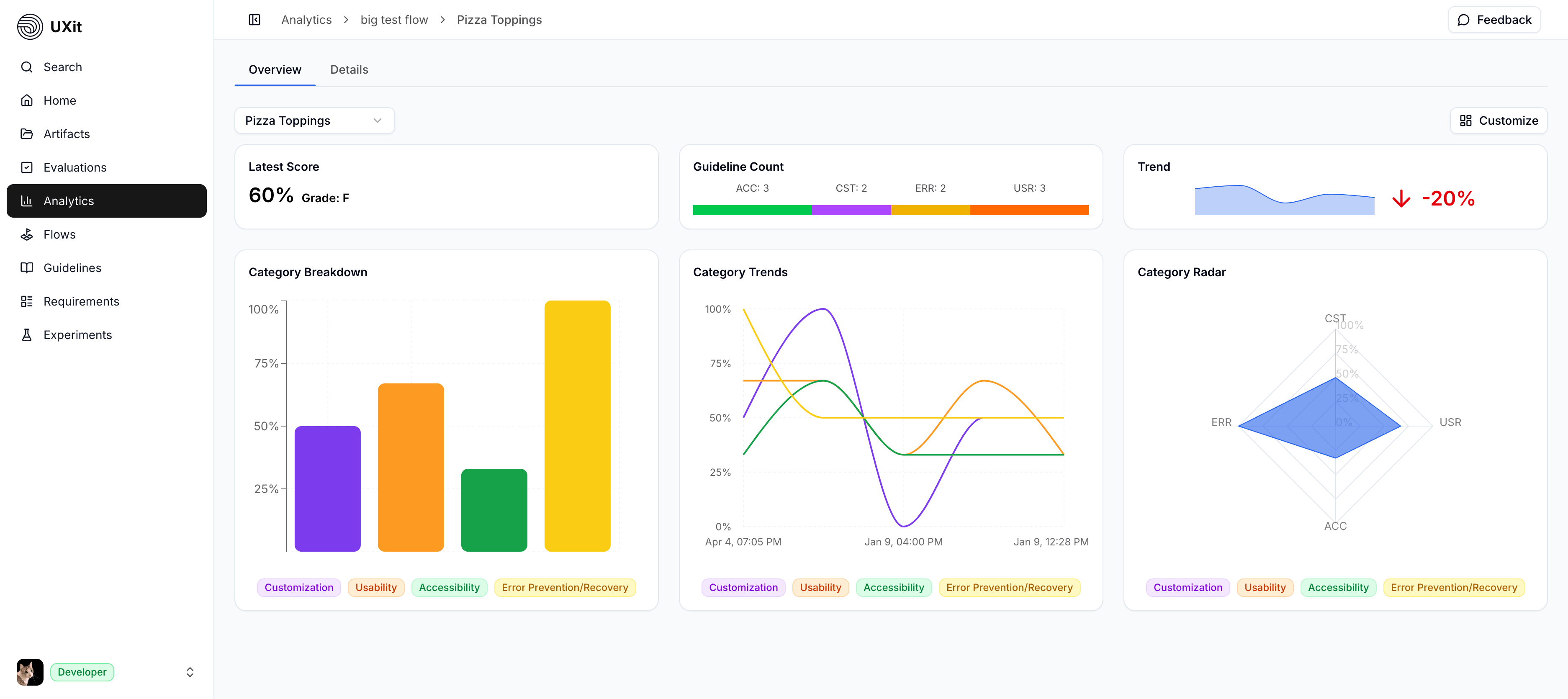
Metric Cards
Latest Scoreshows the most recent evaluation result and grade.Guideline Countshows how the scored criteria are distributed across categories, which helps explain how much coverage each category has.Baseline Trendcompares the latest result with the benchmark baseline so you can see whether the product area is ahead of or behind where it started.Category Breakdownshows where the latest version is strong or weak by guideline category.Category Trendsshows category movement across runs, making tradeoffs easier to see when one area improves and another drops.Category Radargives a quick shape of category balance, which helps reveal uneven performance even when the overall score looks acceptable.
Synthesizing Metrics
The overall score is a starting point, not the full story. A Benchmark can improve overall while one category gets worse, especially when a redesign fixes one set of issues but introduces another. Read the score in layers:
- Start with
Latest ScoreandBaseline Trendto understand direction. - Use
Category Breakdownto see where the latest run is winning or struggling. - Use
Category Trendsto compare categories across versions. - Open
Detailswhen you need the exact criteria, notes, and images behind the movement.
For example, a checkout benchmark may improve because usability and recovery both went up, while accessibility dropped after a layout change. Metrics helps you see that tradeoff quickly; Details helps you find the specific failed criteria that explain it.
Customize View
Coming Soon
More dashboard customization is planned. The current Customize menu lets you show or hide cards and legends; future controls are intended to support card positioning, card sizing, saved views, and layout adjustments so teams can organize the dashboard around the metrics they review most.
Use Customize to reduce the dashboard to the views you need for the conversation you are having.
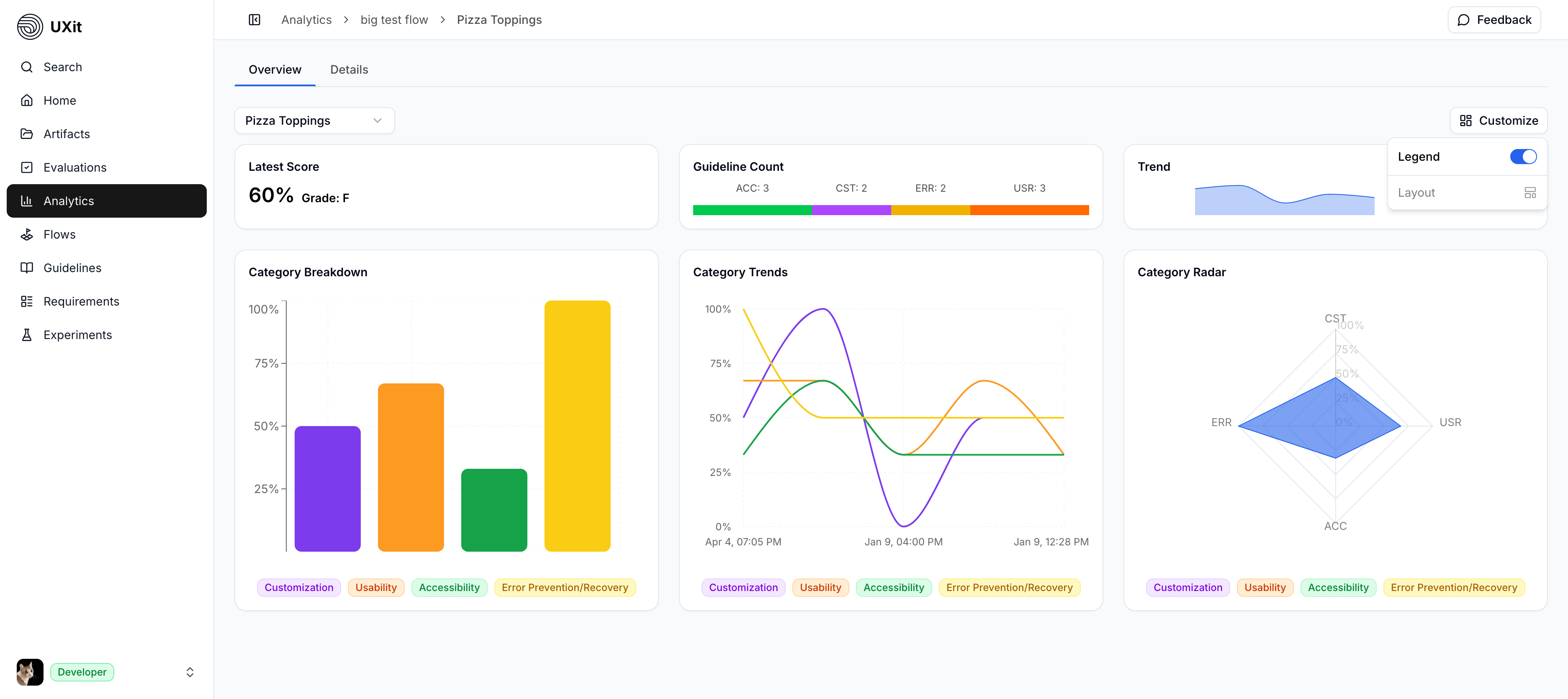
You can show or hide legends and individual cards:
LegendLatest ScoreGuideline CountBaseline TrendCategory BreakdownCategory TrendsCategory Radar
Use Reset to restore the default view.
Tip
Hide legends or cards when you want a cleaner view for a focused review. Most interactive charts still reveal category names when you hover over the data.
Evaluating Conditions Over Time
Use this section when you are evaluating different iterations of the same interface, flow, or product area. Each completed Evaluation becomes a snapshot of how that version performed against the selected Guideline Set. When those runs stay under the same Benchmark, Metrics can show how the experience changed from one version to the next.
Newer versions are not automatically better. UXit is focused on the user-facing interface and experience, measured against the criteria in your Guideline Set. A later version might improve one category while making another worse, and an earlier version may still be the stronger choice overall. This helps you:
- Compare versions without assuming the newest option is the best option.
- See whether a redesign improved one category while creating a problem in another.
- Decide whether to keep an earlier version, revise the latest version, or combine stronger patterns from multiple iterations.
- Use category movement and condition details as evidence in product review, design QA, planning, or stakeholder conversations.
For example:
Onboarding Benchmark: Iteration Comparison

                     v1          v2          v3          v4
Overall Score        64%   ->    78%   ->    88%   ->    82%
Usability            50%   ->    78%   ->    86%   ->    80%
Accessibility        70%   ->    82%   ->    84%   ->    62%
Recovery             60%   ->    74%   ->    88%   ->    94%

Best overall candidate: v3
Important tradeoff:     v4 improves Recovery, but Accessibility drops

Next step:
Open Details for v3 and v4
  -> compare failed criteria
  -> review notes and images
  -> decide whether to keep v3, revise v4, or combine the stronger patterns
Keep the Benchmark stable when the user need or product area is still the same. Keep the Guideline Set stable when you want the cleanest comparison, because changing the criteria changes what the score is measuring.
Preserve comparison history
Major Guideline Set changes can make old and new evaluation scores hard to compare. If you are rewriting categories, replacing criteria, or changing the standard in a meaningful way, create a duplicate or new version of the Guideline Set before making those changes. Use a new Benchmark when the product area or user need has changed; keep the same Benchmark when the experience is still answering the same question.
For a concrete example of how to interpret score changes across runs, see Reading Results.
Pro Tips
- Keep the
Benchmarkstable when the product area or user need is still the same. - Reuse the same
Guideline Setwhen you want the cleanest trend comparison. - Treat a category drop as a lead, not the whole answer. Open
Detailsto see which criteria caused it. - Use notes and images when a failed criterion needs enough context for another person to understand or act on it later.
- Review
Methodologywhen you need to explain exactly how the score was calculated.