Data Visualization
Review evaluation results with charts, trends, and question-level details.
Overview
Data Visualization helps you understand how a completed evaluation performed and where a flow is improving or struggling over time.
This page currently shows analytics for Evaluations. Use it to:
- Review the results of a single completed evaluation.
- Compare multiple completed evaluations within the same flow.
- Spot stronger and weaker guideline categories.
- Identify which conditions caused a lower score.
- Document findings with notes and screenshots.
The page has two sections:
Overviewa visual summary of performanceDetailsa full question-by-question breakdown
The Overview Section
The Overview tab gives you a quick read on the latest evaluation and how that flow is trending over time.

What Each Card Shows
- Latest Score: The overall result for the most recent evaluation of the selected flow.
- Guideline Count: How many criteria exist in each guideline category.
- Trend: Whether results for the same flow are improving, declining, or staying flat over time.
- Category Breakdown: How each category scored based on pass and fail results.
- Category Trends: How each category changed across multiple evaluation sessions for the same flow.
- Category Radar: The same category performance shown in a radar view for a different way to compare results.
UXit shows the same evaluation data in multiple visual formats so users can scan it in the way that works best for them. Some people want a quick score, some want to compare categories, and some want to look for patterns over time.
Reading The Charts
- Use Latest Score and Trend for a quick summary.
- Use Category Breakdown to see which categories are strongest or weakest right now.
- Use Category Trends to see whether a category is improving, declining, or staying stable across versions.
- Use Category Radar when you want a visual comparison of overall category shape and balance.
In the radar chart, a larger and more evenly filled shape generally indicates stronger overall category performance.
Customize The View
Use Customize to show or hide chart legends.
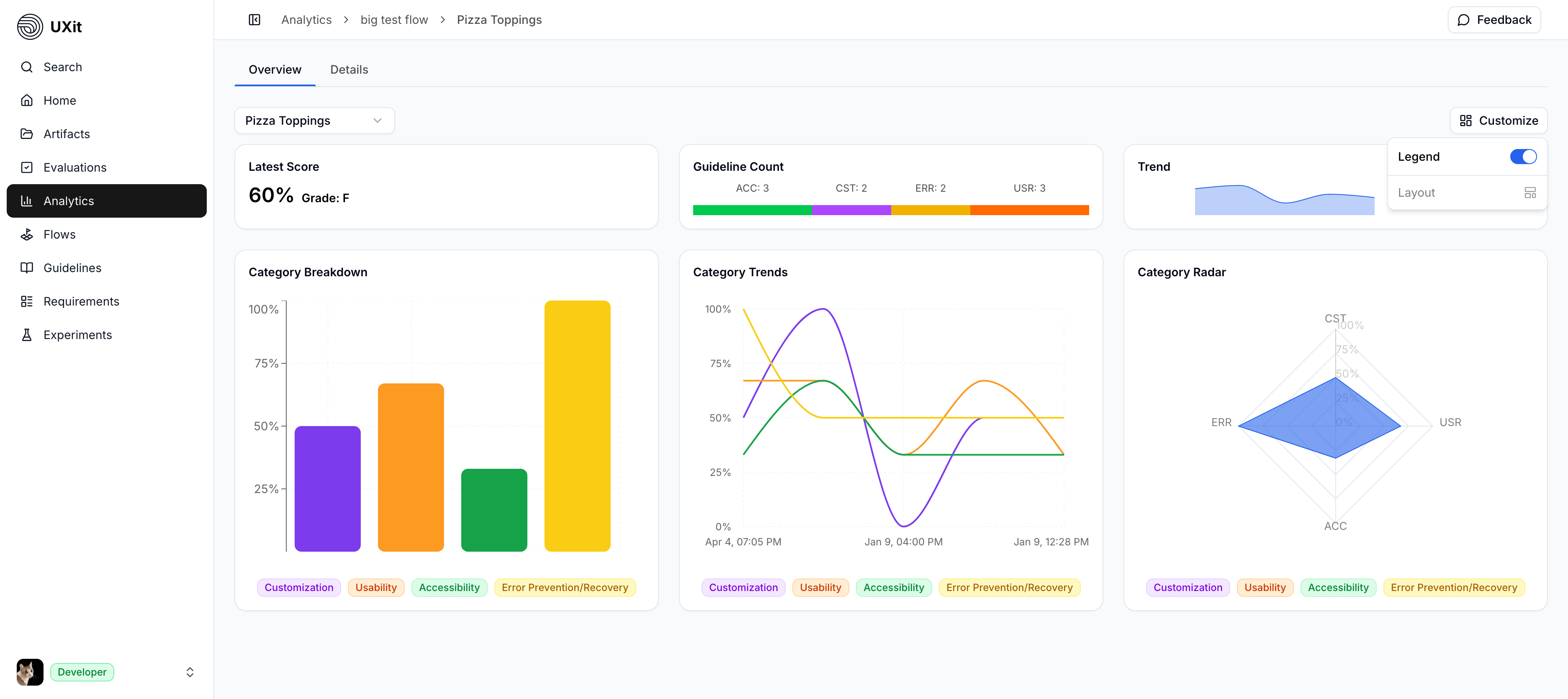
Hiding legends can reduce visual clutter and free up space inside each card.

Even when legends are hidden, most interactive charts still reveal category names when you hover over the chart data.
The Details Section
The Details tab lives on the same analytics screen in the product, but it is documented separately here so the charting view and the question-level breakdown are easier to explain.
Use Data Visualization to understand the summary and trend views in the Overview tab, then see Condition Details for the full searchable table and per-condition notes and image references.
Comparing Evaluations Over Time
Data Visualization becomes most useful when the same flow has been evaluated more than once with the same guideline set.
This allows you to:
- Compare versions of the same flow.
- See whether changes improved the outcome.
- Catch regressions after updates.
- Track category-level progress across evaluation sessions.
If the flow stays the same but the design changes, continue evaluating that flow so the trend data remains useful. If you change the guideline set, comparisons may still help, but they become less reliable.
For a concrete example of how to interpret score changes across versions, see Reading Results.
Best Practices
- Keep the flow stable: Compare versions of the same journey when the core user goal has not changed.
- Keep guidelines consistent: Reusing the same guideline set makes trends easier to trust.
- Start in Overview: Use the charts to spot weak areas quickly before digging deeper.
- Confirm in Condition Details: Use question-level results to find the exact failures behind a lower score.
- Document what you find: Add notes and screenshots so the next evaluation has useful context.
- Review Methodology when needed: If you need the scoring logic behind these visuals, see the
Methodologypage.